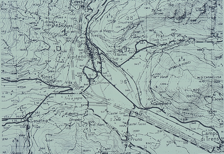
maps may appear to be the result of accurate, scientific measurementeven a topographic map will show the biases, conventions of the creatorcompare the two topographic maps of S Tirolmaps often reveal much about the agenda of their creators
Denis Wood, The Power of Maps (Routledge, 1993): "whose agenda is in your glove compartment?"
map made by the Austrian administration prior to the Treaty of Versailles in 1919when such maps are digitized, their conventions become part of the databasemap at the same scale, of the same area made by Italian administration
results of analysis from these two maps might be very different
GIS databases built from maps are not necessarily objective, scientific measurements of the world
it is impossible to create a perfect representation of the world in a GIS database
therefore all GIS data are subject to uncertaintyit can be very difficult to determine what those confidence limits areuncertainty regarding what the data tell us about the real worldthat uncertainty will affect the results of analysis
a range of possible truthsall GIS results should have confidence limits, "plus or minus"
because GIS results come from a computer, we tend to treat them as more accurate than they really are, tend to ignore uncertainty
uncertainty can arise because:
measurements were not perfectly accuratehere is an example of positional errors in two commercial street centerline databases of Goletamaps were distorted to make them more readable
e.g. lines are often repositioneddefinitions are vague, ambiguous, subjectivee.g. 101 and the railroad through Goleta at a scale of 1:250,000
at this scale both objects are thinner than their map symbols
the symbols would overlap if they weren't moved by the cartographer
the real landscape has changed since the data were collected
the map is generalized
the background fill is darkest where errors are smallestnote how the errors are often up to 100m
a problem if someone reports the location of a fire using one map, and a response is dispatched using the other map
the response vehicle could be sent to the wrong streetnote also how many streets are not in both databasesnotice how errors persist over large areas
the error at one point is not independent of error at neighboring pointsthis is a general characteristic of error in GIS databases
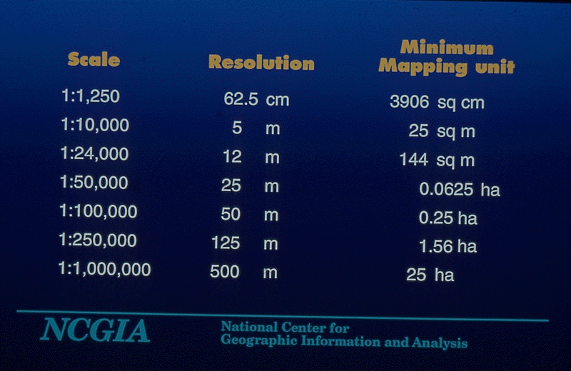
1. Area map measurement example
an example of how uncertainty in a database can propagate into uncertainty about GIS productsa common GIS product is the measurement of polygon area
this example comes from the city of Melbourne, Australia
a layer is to be built of land ownership
showing each parcel of landthis GIS layer will be used to produce maps of land ownershipto be derived by digitizing a map at a known scale
on these maps the area of each parcel is to be shownwhat accuracy can we get when a map is digitized?this can be computed from the polygon vertices using the trapezium algorithm
but what is the "plus or minus" on area?
it depends on the scale of the input map and the accuracy of digitizing
as a general rule of thumb, errors from digitizing, map drafting, registration, stretching of the paper, amount to 0.5mm at the scale of the mapthe average suburban parcel in Melbourne is about 1,000 sq mthe table shows what this means for maps of given scales
third column shows the same expressed as area rather than lengthe.g. a map at a scale of 1:3,000 will produce a GIS layer with a positional accuracy on the ground of 1.5m
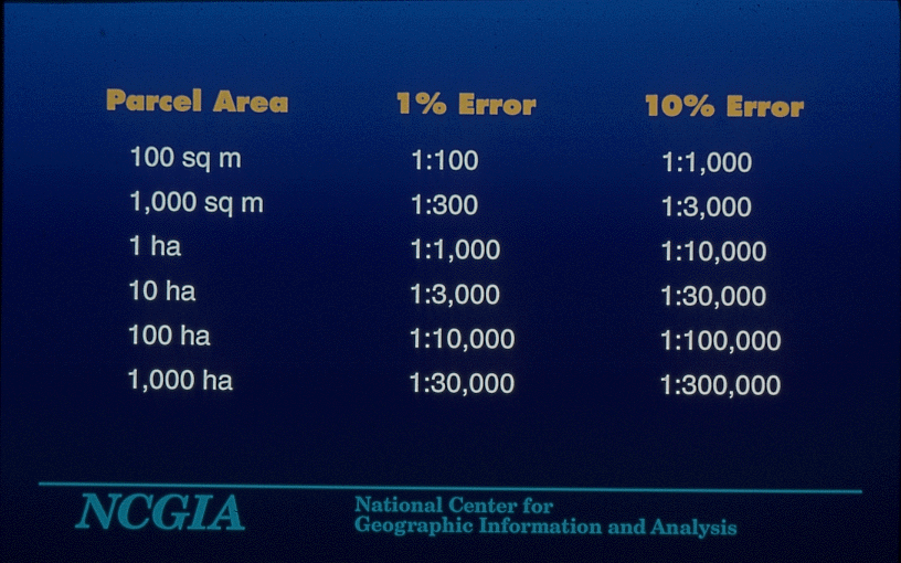
what did the map users want in the way of precision on parcel area?
two decimal places (hundredths of square meters)for a parcel of 1,000 sq m, it takes a map at 1:300 (15cm positional accuracy) to produce areas that are accurate to 1%what data accuracy would be needed to get this accuracy in the calculation of area?
it's a simple calculation, table shows the results
that is, the tens digit is accurate, but the units digit and all decimal places are spuriousa map at 1:3,000 (the actual maps) would result in areas accurate to 10%only the hundreds digit is reliableto get the required accuracy, the map would have to be at a scale of 3:1three times larger than the cityLewis Carroll and Umberto Eco have both written about the fantasy of maps at 1:1 and larger
1. USGS quality description
a DEM provides measurements of the elevation of the land surface at each grid point2. Effects on contour mapserrors are due to:
measurement of the wrong elevation at the grid pointthe USGS provides simple quality statements for its DEMsmeasurement of the right elevation at the wrong location
any combination of these
it is impossible to determine which case applies
given as "root mean square error"this is the square root of the average squared difference between recorded elevation and the truth
roughly interpreted as the average difference
e.g. many DEMs have RMSE of 7m
an error of 7m is commonRMSE can be interpreted as the standard deviation of the error distributionerrors of 10m, even 20m occur sometimes
diagram shows what this means in terms of relative frequencies of errorssmall errors are commonest
32% of errors will be more than 7m
5% of errors will be more than 14m
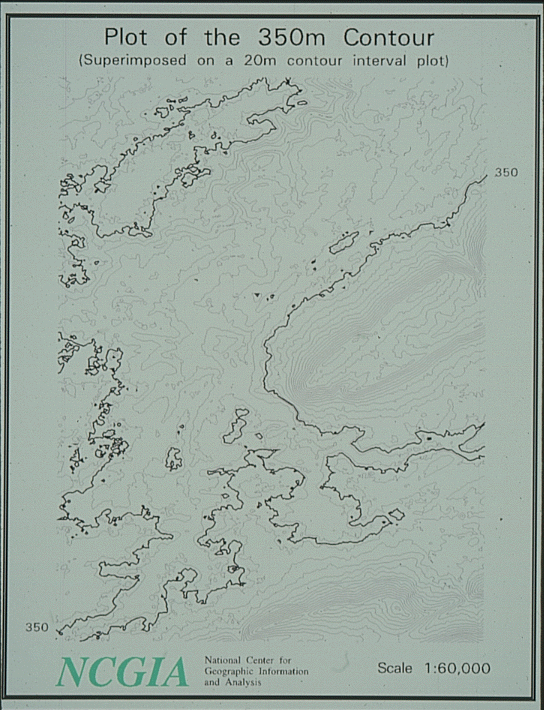
contour maps do not normally attempt to show uncertainty3. Sources of errorwidth of any contour is determined only by cartographic emphasis, pen sizesuppose the RMSE is 7m, what does this mean in terms of the contour position?a contour map of central Pennsylvania near State College
generated from a USGS DEM with 30m spacing
the 350m contour has been widened for emphasis
the colored area shows where the contour might actually bewhat does this error mean in terms of slope estimates?there is still a 5% chance the contour lies outside the colored area
reddish areas are recorded as greater than 350m but might actually be 350m
greenish areas are recorded as less than 350m but might actually be 350m
slopes are calculated by comparing neighboring elevationssuppose two adjacent points are both at 350m
one point could actually be at 360m
the neighbor could actually be at 340m
instead of a steep slope (20m change over a 30m spacing) we would get what appears to be flat land
this assumes that neighboring errors are independent
if they were, the DEM would be virtually useless for many purposes
in fact, errors at adjacent points tend to be similar
both points are erroneously high, or erroneously low
some clues about the nature of errors can be got from looking at the data carefullya detailed contour map of part of the datanotice how there are vertical and horizontal ridges in parallel lines
these are created by the DEM production process, which compares blocks on air photos and tends to concentrate errors at block edges
1. Nature of errors
area class maps show a class at every point2. Simulation modelexamples are vegetation cover maps, soil maps, land use mapsthey imply that class is uniform within areas, changes abruptly between areasin fact both assumptions are wrongexample of an area class mapthere is variation within areas (heterogeneity)
due to inclusions of other classes of unknown size and frequencythere is blurring across boundarieszones of transitionarea class maps have been described as "maps showing areas that have little in common, surrounded by lines that do not exist"a map of soils in part of Northern Ohio (the Medina Quad)focus on the area shown in yelloworiginally digitized by Peter Fisher, University of Leicester
original map scale 1:15,840
4 inches to the milelet's assume the legend says this class is "80% sand, with 20% inclusions of clay"this map is used for many purposes
some involve land use regulationsome involve taxation, compensation
in principle, all of these are uncertain if the map is uncertain
GIS applications are in deep trouble in court if it can be shown that regulations, taxes were based on uncertainty and that no effort was made to deal with that uncertainty
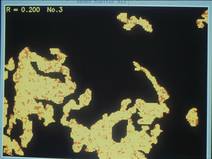
one way to deal with uncertainty is to simulate the effects of the unknown variation3. Impacts on GIS productsthis map is made by a random process, constrained so that inclusions of clay (red) are small, and randomly located, and amount to 20% of the area
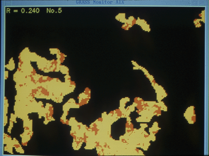
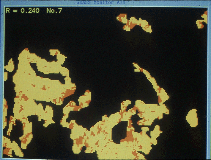
here is another map with the same constraints but different random locations and sizesa parameter of the model (rho, shown in the top left) determines average inclusion sizein the first simulations it was set to .200here and here it is increased to .240
notice how the inclusions get larger, but still occupy about 20% of the areahere and here it is increased to .250, the theoretical limitthe inclusions are still about 20% of the area
in practice we don't know rhono one has ever tried to measure it for these kinds of datathis table shows the impacts of rho on uncertainty in areabut it is essential to know it if we want to determine the uncertainty of certain GIS products
e.g. uncertainty in the area of soil that is clay in a particular farmer's field
the left hand column shows rhothe top line (rho=0) corresponds to complete mixing, inclusion sizes close to zero
the bottom line (rho=.250) corresponds to the situation where the area is either all clay (probability 0.2) or all sand (probability 0.8)
this might happen in a crop example if we knew that the entire area was planted to one crop, but were uncertain which crop it was based on remote sensing
notice how the uncertainty in area estimates (last column) rises sharply with rho
it is much more of a problem with large rho, that is, large inclusions
1. Simulation strategy
these models are complex2. Appletsit's not likely that the average GIS user would be able to understand themthere are many models out theredescribing uncertainty as "a spatially autoregressive model with parameter rho" doesn't help many GIS users
how to get the message across?
much recent research has focused on modeling uncertaintythe producer of data is the person best able to describe uncertaintythe average user can't be expected to understand them all
uncertainty must be communicated through data quality statementsvarious standards exist for describing data qualitye.g. RMSE is 7m
the Spatial Data Transfer Standard (Federal Information Processing Standard 173) has five elements of qualitya general strategy for communicating about uncertaintypositional accuracystandards like this don't help the user who wants to know only what impact uncertainty will have on the results of analysisattribute accuracy
logical consistency
do the data follow all of the expected logical rules?completenesse.g. do polygons close?
many problems of logical consistency can be corrected automatically
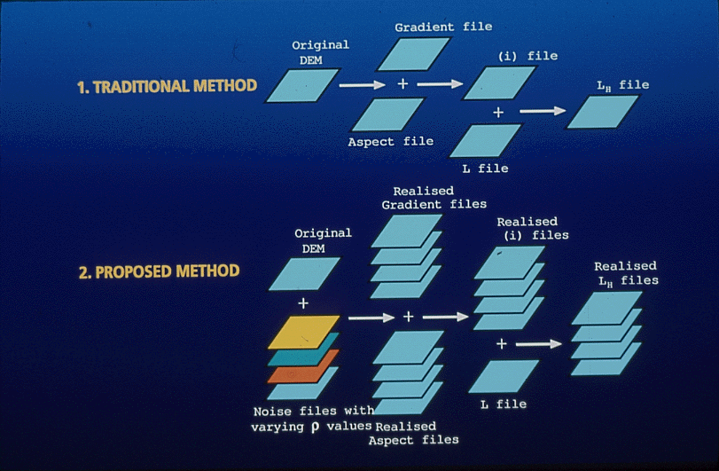
are all features represented?lineagehow the data were created, by what processe.g. knowing which model of digitizer was used is less helpful than knowing the accuracy that it producesproposition: a method of simulation of uncertainty is a complete descriptionthree strategiesthe method is defined by the data producer
it produces simulations, each of which is an equally likely and possible true map
variation among simulations represents uncertaintythe user examines the effects of different simulations on the result of analysisthe diagram compares a normal analysis done with a single data set with an analysis done repeatedly with the actual data plus a series of simulations
ignore the issue completelydescribe uncertainty with measures, e.g. RMSE
simulate equally probable versions of the data
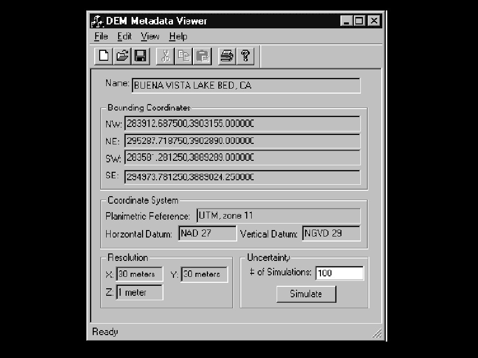
an applet is a small piece of code, written in Java or a similar language, and distributed with the datathe picture shows a mockup of a user interface for examining possible data sets from a library or data archive
a DEMan examplethe bounding box is shown
the sampling interval is shown, and the name of the area
the lower right shows a button
when clicked, the button will initiate a simulation processthe example shows a simulation of uncertainty in the survey of a square parcel of landhow well does this approach do at communicating understanding of uncertainty?each corner point is subject to an independent error in both coordinates
a RMSE of 2mthe simulation tracks the average area, standard deviation, and other statisticsit also shows a histogram of areas
execute the simulation (this will initiate a piece of Java code on your machine)